Context & Challenge
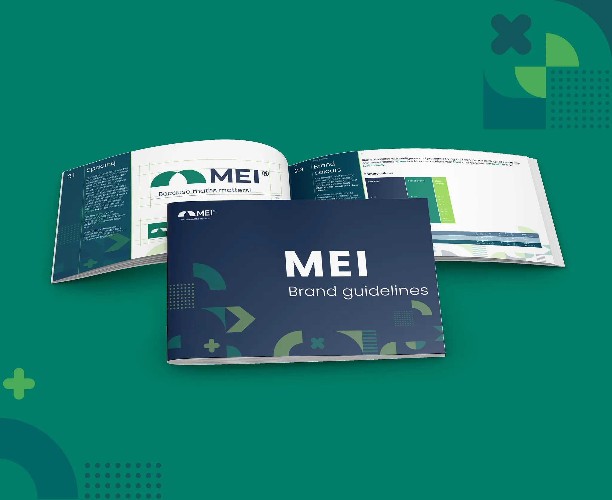
MEI has existed for more than 60 years and positioned itself as leaders in creating well respected and well loved maths resouces but has operated without a full brand refresh in that period. Although the organisation has periodically updated its visual identity, its various programmes (including AMSP and Integral) had developed distinct visual identities of their own and were often perceived as separate entities rather than parts of one organisation. Although the organisation was proud of the quality of its mathematical content, it had historically placed greater emphasis on this than on how that content was presented. Following earlier work to clarify the relationship between MEI, AMSP and Integral, an external UX agency, Ronins, was commissioned to develop a new MEI brand and website that better reflected the organisation's purpose and ethos and strengthen the visual connection of the AMSP and Integral to MEI.
The challenge was not to create a rebrand, it was to make a supplied identity work for the organisation consistently across applications with very different functional demands. A suite of Microsoft templates, certificates, educational resources, posters and social graphics each needed the right amount of visual language that told the same story regardless of where and how a user engaged with MEI while remaining accessible, recognisable and durable over time.
Contribution & implementation
A brand identity provides the visual assets, It doesn't necessarily explain how those assets should behave in every situation.
MEI produces a wide range of communications, from educational resources and competition materials to social media, printed literature, certificates, presentations and video.
A visual treatment that works well on a social graphic doesn't necessarily work on a certificate. Similarly, a layout that works in a printed resource may need to behave differently in a digital resource.
My role was to interpret the new identity for each context while maintaining a recognisable visual relationship between them.
I created and adapted:
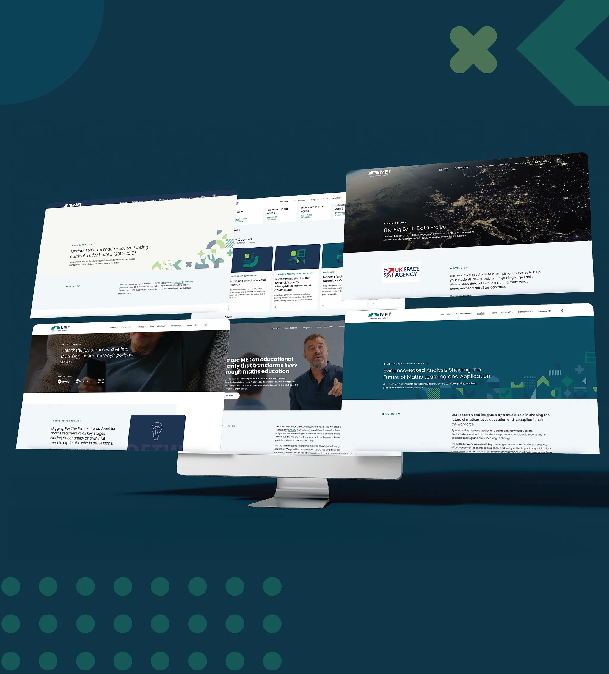
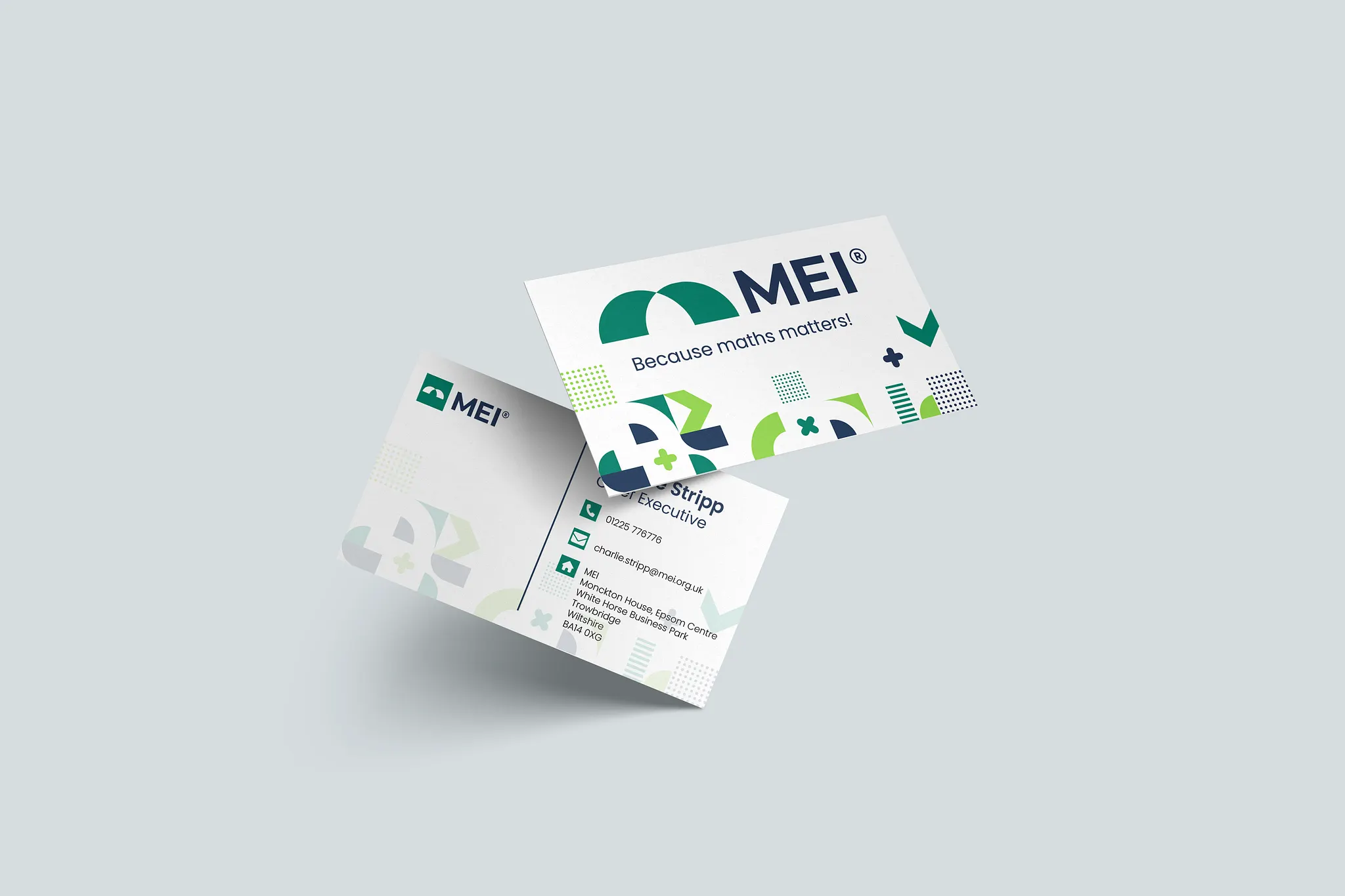
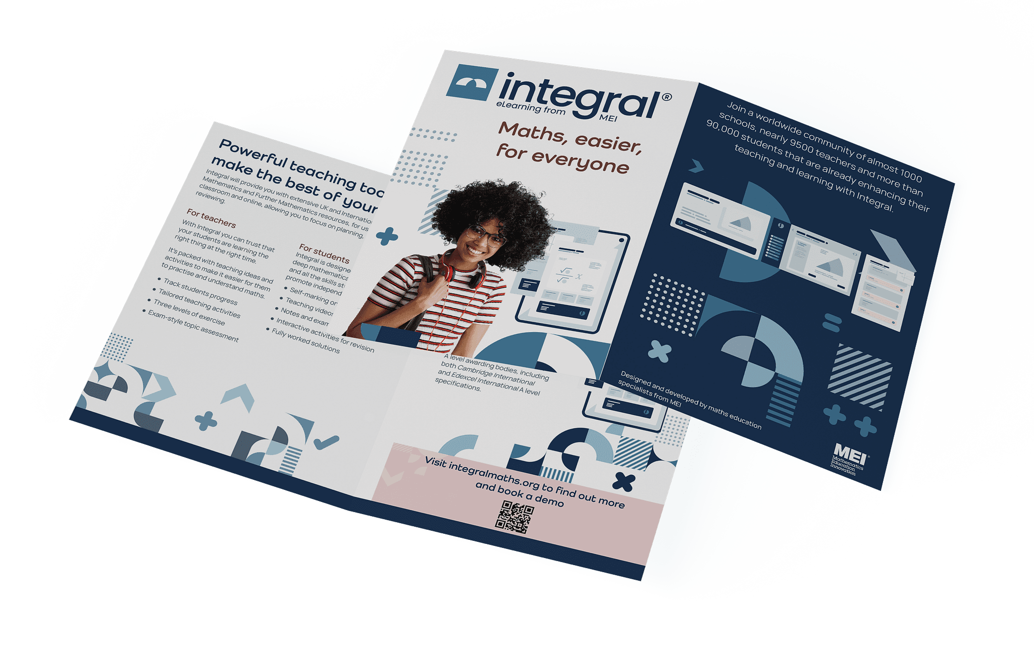
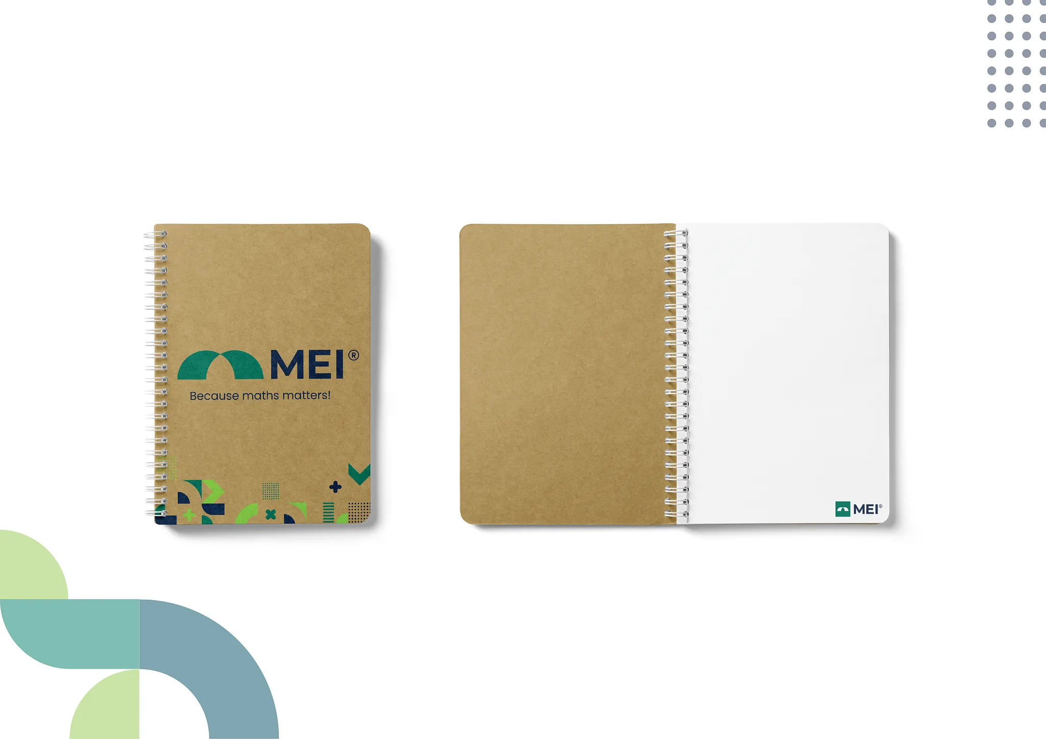
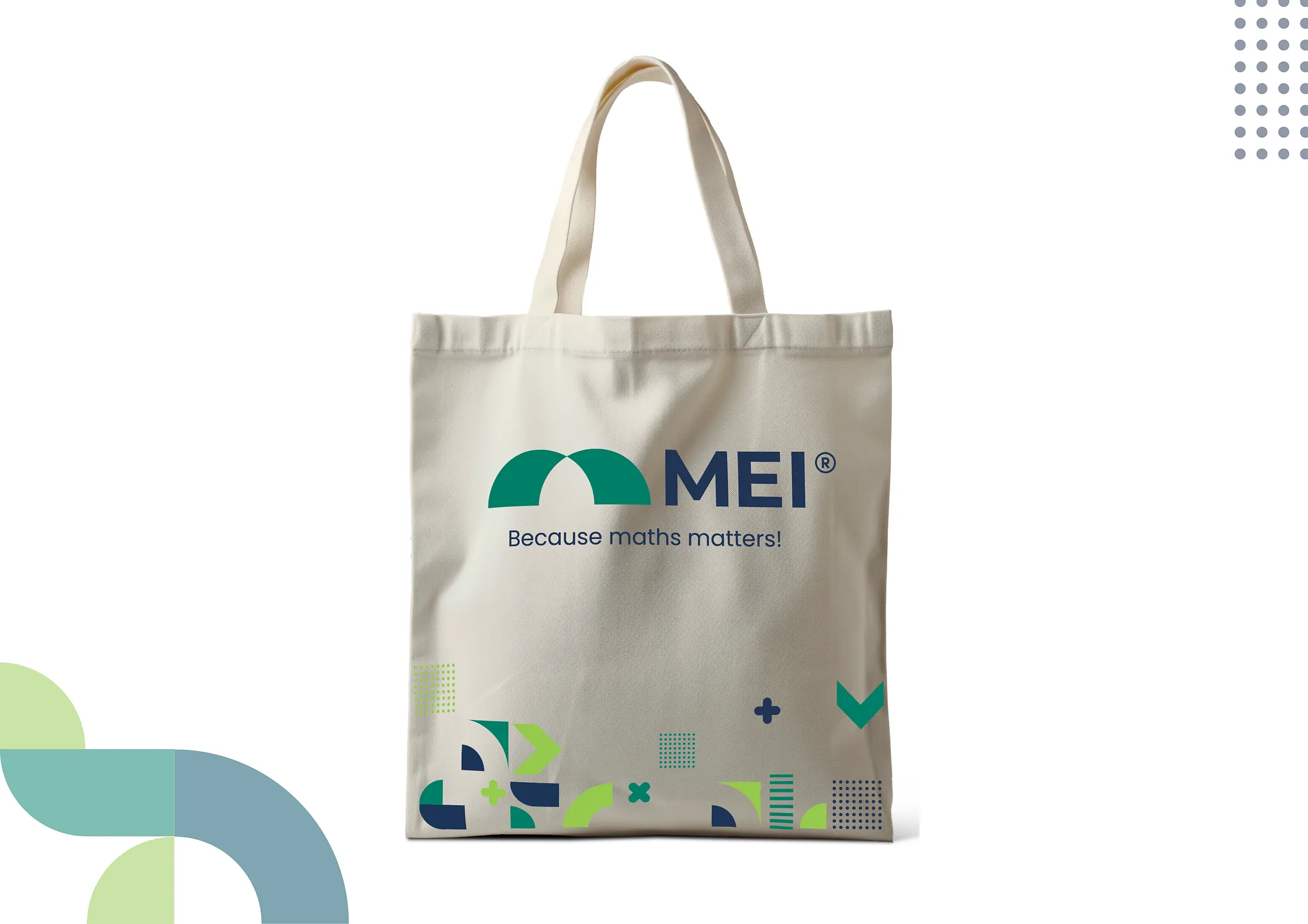
Competition identities · Social media templates · Certificates · Posters · Pull-up banners · Microsoft templates · Website assets · Printed literature · Media kits · Email signatures · Letterheads · Leaflets · Flyers · Merchandise · Video assets
Approach
Working with the supplied visual language
Ronins supplied the core visual assets, including the logo, colour palette, typography options and graphic elements.
One decision I contributed to early in the implementation was typography. Among the options provided by the agency, I helped to make the case for using Poppins, taking into account MEI's position as an education charity and the importance of accessibility.
From there, I established how the supplied elements should be combined and adapted across MEI's communications.
Rather than treating the visual language as a fixed composition, I considered the purpose of each communication and adjusted the balance of typography, colour, imagery and graphic elements accordingly.
Solution
Designing an accessible colour system
One of the practical challenges of implementation was accessibility.
The supplied colour palette couldn't simply be applied in every possible combination. Some combinations created insufficient contrast, while others presented problems for people with certain forms of colour blindness.
I developed guidance around the use and proportion of the colours, identifying combinations that should be avoided and establishing more appropriate alternatives.
This meant that accessibility became part of how the brand was applied rather than something considered after the visual design was complete.
Designing for an organisation, not just a brand
MEI has a passionate and knowledgeable workforce, and many colleagues had worked with the organisation's previous visual language for years.
Some established practices were difficult to reconcile with the new system. One example was the use of handwritten fonts to distinguish questions from answers in educational materials.
Rather than simply removing the practice, I had to explain why it no longer represented best practice and why consistency and accessibility were more important considerations.
The same principle applied to projects that colleagues felt deserved their own visual identity.
My role was to protect the integrity of the new system while remaining open to genuine requirements for adaptation.
Giving the brand a sense of movement
I also developed animated introductions and outros for MEI and its programmes.
Although I had previously used Premiere Pro for video editing, I had little experience with animation. I identified visual references that felt appropriate for the new brand and taught myself the techniques needed to create the motion treatment.
The animation needed to reflect the character I wanted the brand to communicate: serious about mathematics, but also passionate, professional and capable of being playful.
MEI isn't going to rebrand every few years, so I deliberately avoided creating something that relied too heavily on short-lived visual trends and instead prioritised longevity. The intention was to create motion that could still feel appropriate many years from now.
Implementation
The result
The new identity launched in March 2025, followed by the redesigned website in July.
I went on maternity leave shortly after launch, returning approximately a year later. On my return, the new identity had been adopted broadly across the organisation and appeared to have been received with considerable enthusiasm.
The new templates and guidance have given colleagues a clearer framework for producing communications themselves, and the visual system continues to be maintained and developed in-house.
I'm now developing a feedback survey to evaluate how useful the new resources have been and identify where further refinements may be needed.
Reflection
The biggest challenge was balancing consistency with the sense of ownership colleagues naturally felt towards their work.
I'm particularly proud of how I translated a set of externally developed visual assets into a system that works across the very different formats MEI produces.
A year on, there are elements I would refine. In particular, I'd revisit some colour combinations and take a more creative approach to the use of some of the graphical elements within the constraints of how they will be used by the end user.
The implementation has reinforced something I value about in-house design: a brand isn't finished when the identity is delivered. It becomes a design problem again every time someone needs to use it and requires constant adaptions and iterations to make it work for an organisation, not regardless of.