
Context & Challenge
Context & Challenge
Many people want to contribute to charitable causes but don't necessarily have the financial means or desire to donate money. GoodDeed explored how a familiar job-search model could be adapted to help people find volunteering opportunities that matched their skills, interests and availability. The project began with an initial assumption about the barriers people faced when looking for volunteering opportunities. Rather than designing immediately around that assumption, I used user research to understand how people actually approached volunteering and what prevented them from getting involved.
Contribution
I interviewed four people aged 19–35 about their experiences and attitudes towards volunteering.
The research explored:
what motivated people to volunteer
how they discovered opportunities
what prevented them from getting involved
how they evaluated organisations
what information they needed before committing their time
The interviews were synthesised using affinity mapping, identifying recurring themes and patterns before translating them into user needs and personas.
This process shaped a more refined, accurate version of the problem. Rather than simply needing more volunteering opportunities, users needed a way to discover relevant opportunities with enough information and confidence to decide whether they wanted to commit.
This insight became the foundation for GoodDeed.

Approach
Defining the product
I reframed the concept around a simple proposition:
Make donating your time and skills as straightforward as finding a job.
The resulting platform brought volunteering opportunities together in one searchable environment, allowing users to discover organisations and opportunities based on what they were looking for.
The concept deliberately borrowed familiar patterns from job-search platforms. This wasn't an attempt to reinvent how people were searching for opportunities, instead, I focused on removing some of the friction associated with discovering and evaluating suitability of volunteering opportunities.
Understanding the users
I developed personas from the research to represent different motivations and behaviours around volunteering. These helped me maintain a distinction between:
"People who want to volunteer"
and
"People who are actually able and willing to commit a skill to a particular opportunity."
That distinction influenced the how information was presented throughout the experience.
The product needed to answer users practical questions quickly:
What is the opportunity?
Who is it with?
What would I actually be doing?
Where is it?
Does it fit my interests and availability?
Can I trust this organisation?
Information architecture
I developed the information architecture and primary user flows before moving into detailed interface design.
The core journey centred around:
Discover > Search > Evaluate > Save > Apply
However, early testing revealed that users didn't naturally understand "saved opportunities" and "applications" to be the same thing. I therefore separated these destinations within the navigation rather than forcing both behaviours into a single area.
This was a good example of the design being driven by observed behaviour rather than assumptions.
Solution

Designing for trust
One of the more interesting findings from testing concerned users' perceptions of different charitable organisations. Participants expressed different levels of trust depending on the size and familiarity of an organisation.
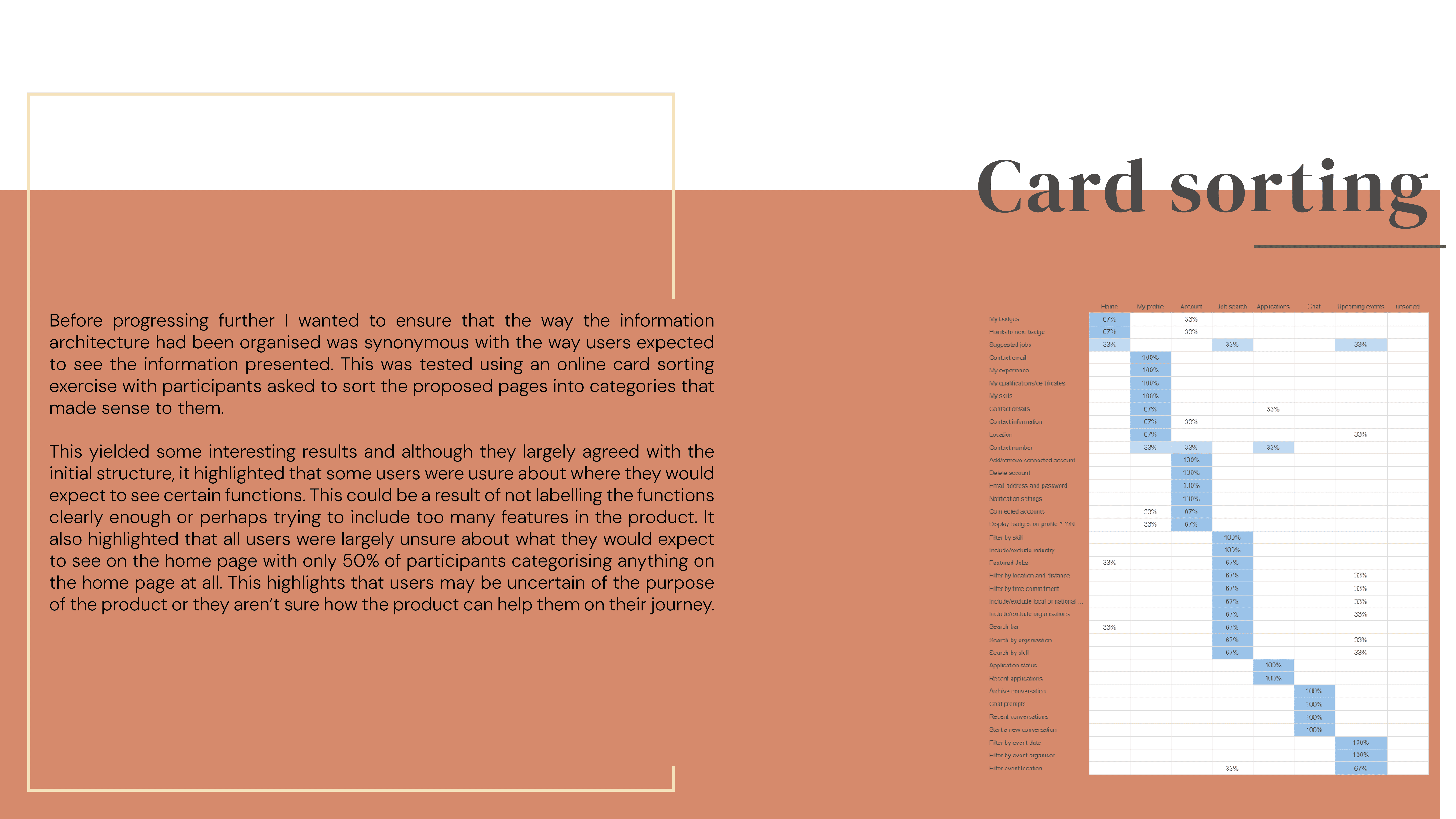
I responded by introducing organisational categories that allowed users to distinguish between local, national and global organisations. I then used card sorting to test whether those categories made sense to users.
This wasn't something I had simply decided should exist as part of the interface. It was a direct result of research findings and was subsequently incorporated into the core principles of the design and tested.

Implementation
From wireframe to prototype
I developed the interface progressively from low-fidelity wireframes through to a high-fidelity interactive prototype. The design was repeatedly tested and refined throughout the process.
Rather than becoming attached to individual layouts, I treated each iteration as a hypothesis:
What are users struggling with?
Why are they struggling with it?
What change might address that?
Does the revised design work better?
That approach is still central to how I work today.
Usability testing
I conducted multiple rounds of usability testing throughout the project. Testing identified issues with navigation, categorisation and the relationship between different areas of the product.
The final prototype was tested again with three participants.
The revised navigation was easier for participants to understand, although testing also identified further opportunities for improvement — including adding text labels alongside navigation icons.
The result wasn't treated as a finished product simply because the final test had been completed. The remaining issues became part of the product's future development considerations.
Visual identity
Alongside the UX work, I developed GoodDeed's visual identity and UI design. The intention was to create something approachable and contemporary while maintaining the clarity expected from a functional employment-style platform.
The visual design supported the product rather than becoming the primary focus of the project.
Looking back, this is probably where I would push the work further today. The underlying product concept remains strong, but I would explore a more distinctive visual direction and look for opportunities to make the interface more engaging without compromising usability.

Reflection & Outcome
Reflection
GoodDeed remains one of the projects that best demonstrates my approach to UX.
I think I did particularly well at research, analysis and defending design decisions with evidence. The design wasn't driven by what I personally thought users should want. Research findings shaped the platform, and usability testing informed subsequent revisions.
There is also a limitation to the project that I recognise more clearly now which is that GoodDeed doesn't fundamentally reinvent the job board. Its innovation lies more in applying an established interaction model to a different problem than in creating an entirely new product paradigm.
I don't see that as a failure. In retrospect, it demonstrates an important principle of product design: a familiar interaction model can be valuable when it removes friction from a different context.
My professional UX practice has also become considerably more pragmatic since completing the project. The level of research, analysis and testing represented here isn't always realistic within a commercial environment. In practice, I have learned to scale the process to the available time and resources by using reusable personas, smaller testing groups, shorter questionnaires and more focused research questions rather than attempting to reproduce an academic research process for every project.
The biggest change has been understanding how to make UX methodology practical rather than simply knowing how to perform it.
Outcome
GoodDeed resulted in a complete UX concept and interactive prototype demonstrating the journey from research through to validated interface design.
The project established a clear product proposition, information architecture, user flows and visual system, supported by iterative research and usability testing.
It also demonstrated something that has remained important in my practice: If research demonstrates that something isn't working, I'm comfortable changing it.