
Context & Challenge
MEI didn't previously have comprehensive brand guidelines. Although there was a small marketing team, people across the organisation had developed their own ways of using the brand. Logos were altered, colours changed, clip art appeared in documents and typography could change halfway through a resource. Resources largely lacked consistency and standardisation. The new identity created an opportunity to address the problem at its source. Rather than simply documenting the visual assets supplied by the external agency, I developed a practical brand governance system designed to help colleagues with varying levels of design experience and aptitude represent MEI consistently.
MEI's brand was effectively owned by everyone which meant it could also be interpreted by everyone. This created a particular challenge for an organisation where I am the only designer. Its not realistic to expect every piece of comuncstion that holds the nrand loto to be reviewed before it goes public so the system needed to do more than tell people what the brand looked like. I needed to create somethinf tnah would aide them in making good decisions without a designer standing beside them.
Contribution & implementation
Using the original brand positioning and story developed by Ronins, I created comprehensive brand guidelines covering the three connected brands:
MEI · AMSP · Integral
Each section covers:
About
Positioning
Our story
Logos
Typography
Colour
Graphics
Look & feel
Working closely with the marketing team, I wrote the sections relating specifically to the visual representation of the brand. I leaned on the experience and expertise of those within the team who had organisational context and historical knowledge of how the brand is used in practice. The full document is approximately 70 pages.
Rather than treating the guidelines as a static record of the agency's work, I established practical rules for how the identity should actually be used. These included rules around colour, proportions, typography, negative space and logo misuse.
Designing for non-designers
The guidelines aren't intended for designers.
I'm the only designer at MEI, so the people using the system are colleagues with very different levels of technical and design experience which changed how I approached the documentation.
I used visual examples wherever possible and created examples of correct and incorrect usage rather than relying solely on written rules. This was to streamline the amount of time it took for colleagues to find the information the needed. The document is large and colleagues across the organisation are often limited on time so I prioritised communicating visually with further written context in order to get the information across effectively.
Following feedback and observations that there were still instances in which the guidelines weren’t being followed, I also created a shorter brand cheat sheet for new starters containing the information people are most likely to need immediately:
Logo clearance · Colour codes · Proportions · Typography · Logo misuse
The full guidelines provide depth; the cheat sheet provides speed.

Approach
Documentation alone doesn't guarantee consistency.
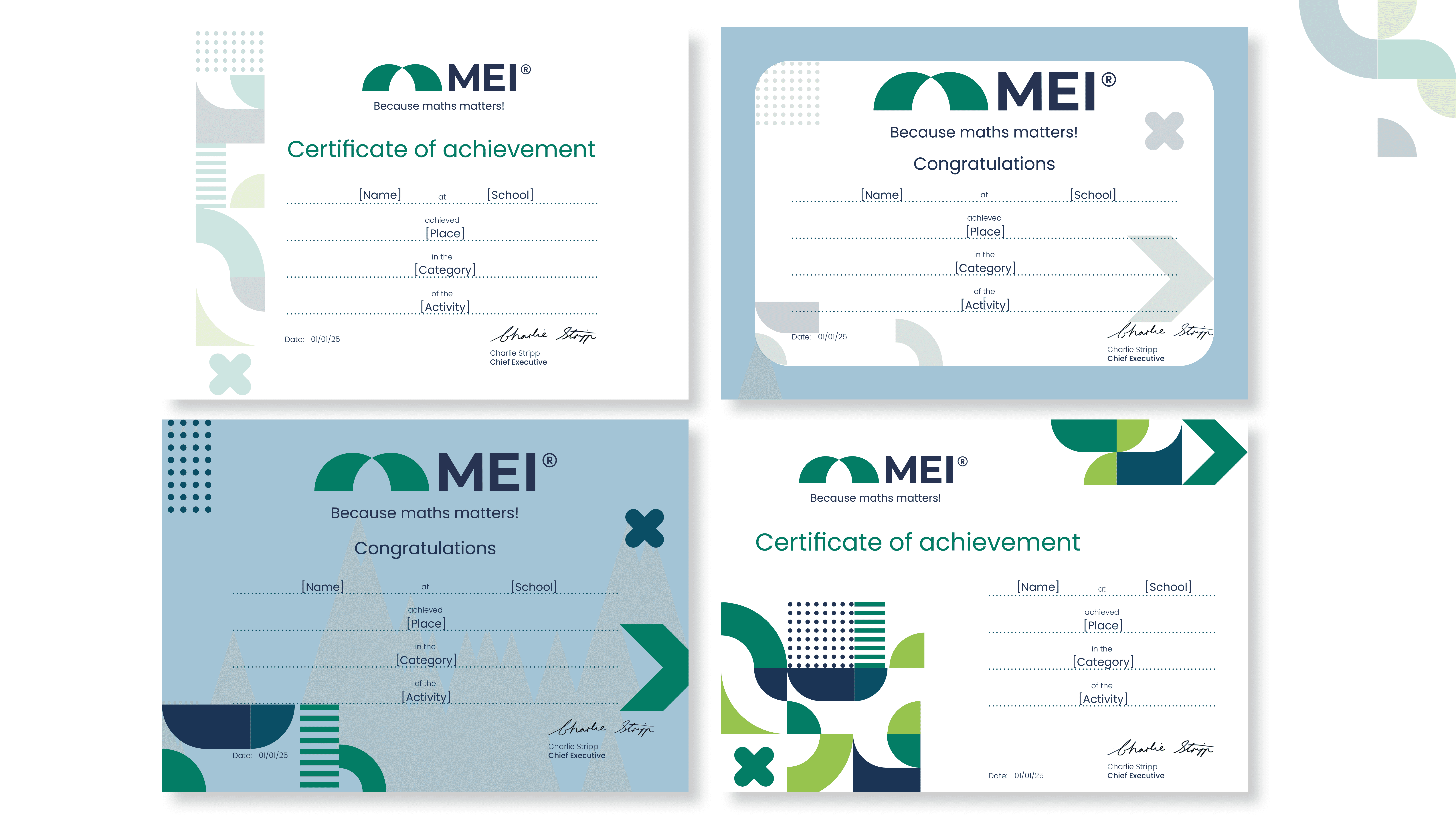
I created a collection of templates and supporting resources so colleagues could apply the system without having to recreate designs from scratch.
These include:
Social media templates · Word templates · Certificate templates · Media kits · External brand guidelines · Brand cheat sheets
The templates establish the basic visual structure while still allowing colleagues to create the content they need.
Design Solution

Creating a system for external partners
MEI works with a range of external partners and suppliers across a variety of courses, events and competitions.
Rather than relying on individual conversations to explain how the brand should be used, I created external brand guidelines that can be provided when partnerships begin along with a logo set.
I have also developed a media kit for people interested in working with MEI which is being tailored for use in competitions and events. The intention is to send our media packs to those participating which will enable them to promote the event within the established guidance of the brand.
This moves brand governance beyond the organisation itself and gives external collaborators a consistent set of guides to work with.
Extending the system into UX
The governance work also led into the adoption of some UX practices across the organisation.
After completing my Master's, I noticed that colleagues were already applying UX practices across different teams, but often without shared terminology or a consistent understanding of how those practices could be used.
Following conversations about standardising course creation, I created a UX cheat sheet to give colleagues a common reference point.
This wasn't about turning everyone into UX designers. It was about giving people enough shared knowledge to recognise and apply useful UX practices consistently.
Knowledge transfer
Several years ago I ran a six-month project redesigning the AMSP PowerPoint presentations and subsequently trained colleagues to use the new templates.
For the latest templates, I created recorded instructions that colleagues could refer to independently as and when they were needed. This supported both colleagues in the adoption of new templates in my absence but also provides guidance for new starters to ensure everyone is starting from the same point.
This is an important part of the governance model: the system needs to survive without the designer being present.
Balancing consistency and flexibility
A key challenge that was identified early on in this process was that a governance system can easily become too restrictive.
Colleagues sometimes have legitimate reasons for wanting to deviate from the standard approach, while other deviations simply come from personal preference or established habits.
Every request for exception requires nuance and understanding of where this has come from and therefore cannot always be treated in the same way.
Where I identify a recurring or genuine requirement, I'll consider whether the system itself should adapt. Where a change would undermine consistency without solving a meaningful problem, I'll explain the reasoning behind the existing guidance.
That distinction has become an important part of my role as the brand's day-to-day custodian.


Result
The new guidelines and supporting resources were introduced alongside the 2025 rebrand.
The system has been adopted across MEI, AMSP and Integral and continues to be used by colleagues and external partners.
The new brand has also given the organisation a clearer shared visual language, while the templates and guidance allow colleagues to produce work independently without needing direct designer input for every communication.
I'm currently developing a feedback survey to assess how useful the resources are in practice and identify areas for improvement.
Reflection
The project has changed how I think about brand guidelines.
They aren't simply a document explaining what a brand looks like. For an organisation without a dedicated design team, they are part of the design system itself.
If I were revisiting the work now, I'd refine some of the colour guidance and simplify the use of graphical elements in places. A year of seeing the system used in practice has made it clearer where the brand benefits from restraint.
The biggest success, however, is that the system doesn't require me to be present every time the brand is used.
The aim wasn't to control every piece of communication. It was to give people enough structure to make good design decisions themselves.