
Context
Bellatelier is an independent maker specialising in bespoke curtains, blinds, cushions and upholstery. The business had previously operated as Maison Bella, with an identity built around the personality and handmade nature of the work. As the business developed, however, the existing name and visual language increasingly felt disconnected from where the maker wanted to take it. The challenge was to create an identity that retained the warmth and craftsmanship of a small independent studio while giving the business a more established, distinctive presence.
Challenge
Making a business feel premium without looking the maker.
The quality of Bellatelier's work comes from traditional making: measuring, cutting, stitching, upholstering and finishing pieces by hand.
The new identity needed to communicate that expertise without relying on the familiar visual language of small craft businesses. Equally, pushing too far towards conventional luxury branding risked making the studio feel impersonal.
The opportunity sat somewhere between the two:
heritage craftsmanship, presented with contemporary restraint.

Approach
From Maison Bella to Bellatelier
The change in identity began with the name.
Maison Bella had warmth, but its French construction and relatively generic associations didn't say much about the particular nature of the business.
Bellatelier combines the familiarity of Bella with atelier — a workshop or studio associated with skilled, bespoke making.
It retains a connection to the business's previous identity while shifting the emphasis from the individual towards the place and practice of making.
The supporting line The Makers Studio reinforces that idea, positioning Bellatelier as a creative workshop rather than simply a sewing service.
Finding the visual language
Craft without cliché
Early exploration looked at the visual language surrounding traditional textiles, British interiors, tailoring and heritage craftsmanship.
Botanical illustrations, decorative serif typography and sewing references all felt appropriate, but combining too many of them quickly pushed the identity towards something overly nostalgic and generic.
The design therefore became an exercise in restraint.
Rather than illustrating everything Bellatelier does, I focused on creating a small set of recognisable elements that could work together across the brand.
Solution

The identity
Making becomes the signature
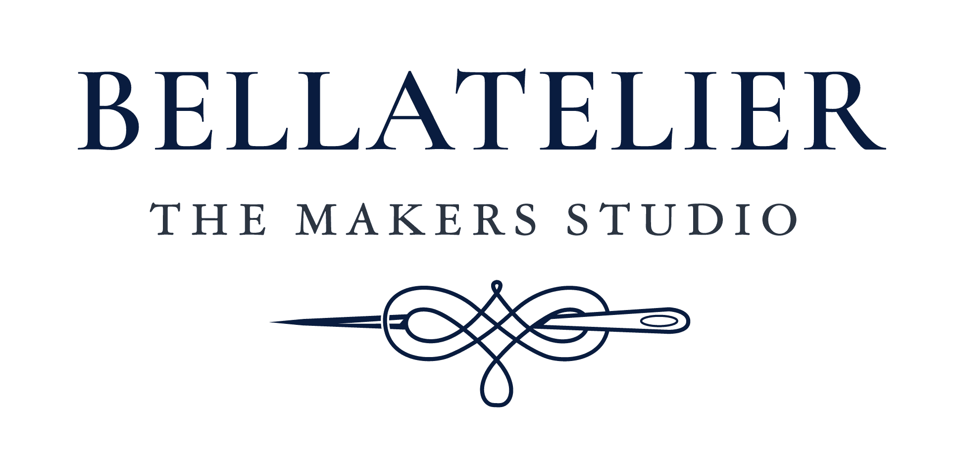
The final identity pairs an elegant serif wordmark with a bespoke needle-and-thread device.
Rather than simply acting as an illustration of sewing, the continuous thread creates an ornamental flourish which allows the mark to reference the craft without becoming overly literal.
A deep navy gives the identity the permanence and confidence of traditional British interiors, while warm neutral materials allow the work itself — fabric, texture and craftsmanship — to remain central.
Implementation
Building a flexible system
Rather than expecting a single logo to work everywhere, I developed a small family of marks for different applications.
The primary wordmark and needle device provide the fullest expression of the identity, while a BA monogram creates a more compact signature for applications where the full marque would lose impact.
A circular variation gives the identity another practical format for stamps, stickers and social applications.
Together, they allow Bellatelier to adapt to different contexts without changing its underlying visual language.
Designed for makers
Bellatelier doesn't primarily exist on a screen. Its identity ultimately needs to sit alongside the materials and objects the studio creates.
That made physical application an important test of the system.
The simplified marks were designed to remain recognisable across woven labels, embroidery and small-format applications, while the full identity could carry through into stationery, packaging and client-facing materials.


Reflection & Outcome
An identity built around making
Bellatelier's new identity gives the business a more confident expression of what was already there: skilled, considered craftsmanship and an appreciation for things made to last.
Rather than reinventing the character of the business, the project was about finding a visual language capable of expressing it more clearly.
The result combines traditional references with a restrained contemporary system that can grow with the studio. From a small woven label sewn into a cushion to the wider experience of the Bellatelier brand.